Posts

Red panda

Image
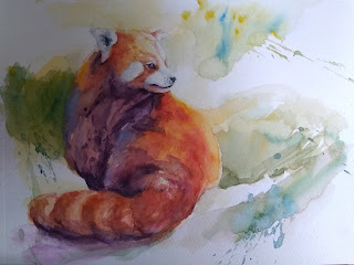
  The watercolor master classes were over last week. It wasn't so easy to get up before 4 am to sit on the zoom meetings, but once they started, I enjoyed them. An early bird was not my life style, but I think I can enjoy it with help of a nice strong coffee with milk. After the classes were over, I began to watch the wildlife course videos that were added to the classes. Yesterday, I painted along a red pander and then painted the same subject by myself. I am happy that it turned out. I am a little more confident now. I can make muddiness for my advantage. 

Walnut ink drawing

Image
  I got Tom Norton's walnut drawing ink and experimented. I love the subtle, old photo-like effect. 

Magnolia

Image
  I have tried again to follow Fabio Cembranelli's approaches to flower paintings. He is particularly interested in using background to show off his main subjects, yet leaving certain edges to blend each other by wetting paper randomly--rather, across edges. He also lifts wet paintings to add textures using a flat synthetic brush. I have difficulty in blending. The paper that I was using makes blending more difficult.  Fabio Cembranelli

Portrait

Image
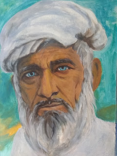
  The fifth portrait painted in a row using acrylic paintings. I am glad that it took less time to paint this one than previous ones. The skin tones are rather close to the photo. In watercolor paintings, the brightest parts are not painted, leaving the space in white color. This is not necessarily translated into white color in acrylic paintings. White makes the surface look cold. I used a combination of yellow and bright red. Source: https://www.pexels.com/photo/elderly-man-in-white-button-up-shirt-and-headwear-4556737/ (M. Y Dogar)

Hummingbird studies

Image
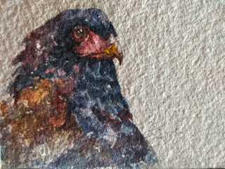
  The 18th day of the 20-day challenge. Taking some unexpected excursions, I didn't paint a bird everyday, but I made an effort to do so. A hummingbird was my subject today. How can I represent the bird's lightness without being bogged down by details? 

Monotone watercolor

Image
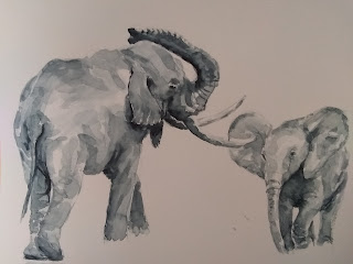
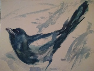
 Wonderful study of values! Using recently purchased payne's gray, I created  a few monotone watercolor paintings of birds, dogs, and elephants. It looks like a B/W photo, arousing nostalgia.  

Saving a bison

Image
  (size: 6 x 4.5)   Being mindful of tonal values, I painted a bison, but it turned out to be a like a golden pig. I retouched it with colored pencils, but that medium was not strong enough to change the overall impression. I then added texture and enhance the contrast with watercolor markers. Wow, they changed the game. The pigments in the markers gave the little painting a life. 

Flying baby elephant

Image
  A small fun project. I tried to paint a baby elephant, keeping in mind tonal values, but couldn't help working over and over back and forth.  (Inspired by Coco bee art: https://www.youtube.com/watch?v=Izswngv8df4)

Twenty-day challenge of bird painting

Image
 The fifth day in my 20-day challenge of painting a bird in watercolor every day. Today I decided to paint a rooster on my own, as opposed to following a video demo. This allowed me to spend more time in each step and examine a subject more carefully. A camera helps me see my painting from a distance. I already see more things I might be able to do. Overall, however, I am happier with this than the previous ones, which I created by following tutorials.  

Jiffy in watercolor

Image
 Having been following YouTube tutorials, I gave a shot. The overall tone seems too light. Yet, it's watercolor after all. 

Mixed media

Image
I am getting more comfortable with watercolor paintings. Artists use the medium in many different ways, from simple illustration to photo-realistic representation. Diane Antone touches her paintings with dark watercolor pencils. It gives a little more definition to a painted object, yet does not fail to lose painterly quality. Since I don't have such pencils, I used color pencils and sticks. I am happy with the result.     

No need to tell everything

Image
  "There is no need to tell the review everything." - Hazel Soan (quoted by Tom Shephard). I watched Fabio Cembranelli' watercolor painting demo. I love his bold brush strokes and impressionist feelings. When I tried the same, though, things came out just muddy.  

Daily dose

Image
As I wanted to create holiday cards with watercolor paints, I searched some good examples on YouTube. There are a slew of tutorials. I focused on birds. Each artist took different approaches. I tried to follow some of them. Some turned out to be OK, but I wasn't satisfied with most of them. But this artist, Tom Shepherd. I like his style, bold stokes with saturated colors. I am happy with this result.   

Simple but accurate

Image
 New paper made by Shizen. It is 5x7 in size with a very rough surface made of 100% recycled consumer waste. Well, it is better than Canson watercolor sketchbook. It holds a lot of water and indeed blends colors. 

Bold brush strokes

Image
 Tom Shepherd is inspirational. His bold brush strokes and limited, but saturated colors. I am happy with the strokes I tried in this painting. It looks like a watercolor painting and it is. 

Drawing of birds

Image
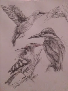
 Pencil drawing, added light colors with color sticks. 

Cardinal

Image
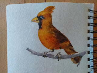
  The first watercolor painting of a bird that I painted on my own. 

Compressed sticks

Image
  I purchased a good-looking drawing set that includes lots of pencils, compressed sticks, and others. I just wanted to try out them all. The sticks are quite hard. Without blending, they leave unorderly marks. I wish to leave marks, but beautiful ones.  

Eye study

Image
That's what it takes.  Eye ball: Yellow as the glowing basis. Add burnt sienna and dark brown on top of it. Increase intensity as it goes and blend them.  Around the eye: watery color as the basis and watery brush strokes for fur. Then add darkest colors. Finally add brunt sienna around the eye.  Tutorial by Rebecca Rhodes, https://www.youtube.com/watch?v=CekQ8brBQkM  

Moon Jae-in

Image
At his Himalaya tracking. Charcoal pencils, brush, and eraser.